Category: User Experience
-

Using Complexity To Fix Complexity
Ann got a severe bronchial infection while she and I were living in India. We called a doctor who came to our hotel and assessed her health, he wrote out some prescriptions for several medicines and we were able to pay him and buy all the medicine for less than the copay in the United…
-
Obviously Not Obvious
On my way back from the airport, I decided I need to get some gas and pulled up to a local gas station. I went through the usual paces: credit card, zip code, No, I do not want a car wash, nozzle, gas grade, pump. And nothing happened. After putting the nozzle back, pushing the…
-
The Difference Between Precision and Accuracy
Much of the work that I do has all sorts of approximations and guesses. Most of it is done on a computer and one really nice thing about a computer is that it will generate a great degree of precision. Want to know how many Watts that new device is going to use before it’s…
-
The Standing Desk Disconnect
Recently, I started experiencing some back pain and started thinking about improving my work ergonomics. I had never tried a standing desk but noticed a number of the people I worked with had them and I’ve wanted to try it ever since reading about the perils of sitting to much. Fortunately, I was able to…
-
Good Design Requires Many Unseen Iterations
Anyone who has ever written software knows that if you were to lose your code after working for 3 weeks, you could rewrite it again in a fraction of the time. The reality is that finding the right solution is not a straight line, it’s iterative. Like this picture: Another great example of the process…
-

Construction & Destruction
Several weeks ago, my friend and I were both talking about the nature of starting businesses. He mentioned a thought he sent me some thoughts: Companies are both constructive and destructive forces. When a business creates a new way of looking at the world, it destroys the old to bring in the new. One…
-
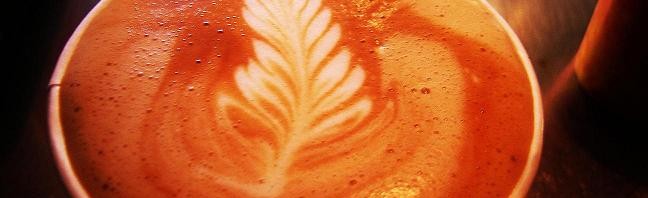
The Sublime Joy of the Subtle
I initiate the ritual by ordering my cappuccino. The barista pounds out old grounds, the grinder whirrs to life and professional hands expertly level and tamp the grounds. The espresso pump shoves hot water through the fresh coffee and the barista froths the milk into a creamy foam that floats in the cup. The expectation…
-
The Art of Trimming
Walking home from my spinning class this morning, I noticed a man trimming a tree. Not an extraordinary event, but it struck me: Here was a pile of vibrant green leaves on the ground and when you looked at the tree, it was still full of the same verdant leaves. After the gardener cut the…
-
Can you have too much choice? [The Paradox of Choice Reconsidered]
You walk into your local burger joint and the menu says: “The Ultimate Customizable Burger – $5”, and that’s it. Since it’s the only thing on the menu, you ask for “The Burger” and the person behind the counter responds: “What kind of meat would you like? We can make it with beef, bison, lamb,…
-
Crazy Tech Apps
All of us have encountered an insane application of technology at some point in our lives causing us to have the “what were they thinking” moment. The amazing thing is that they were thinking, and their thoughts were that this application of technology was perfectly normal. In fact, they usually were thinking it was the…